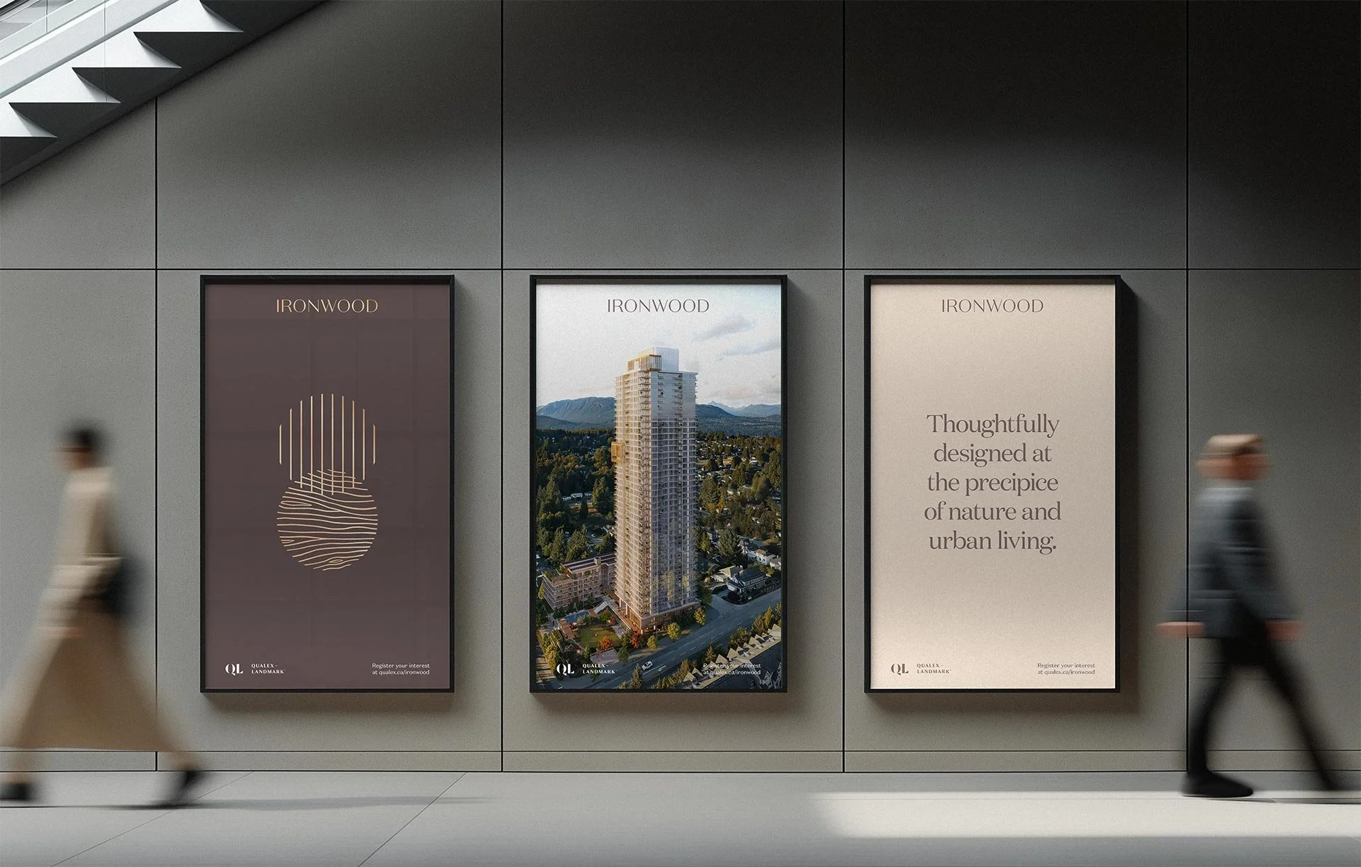
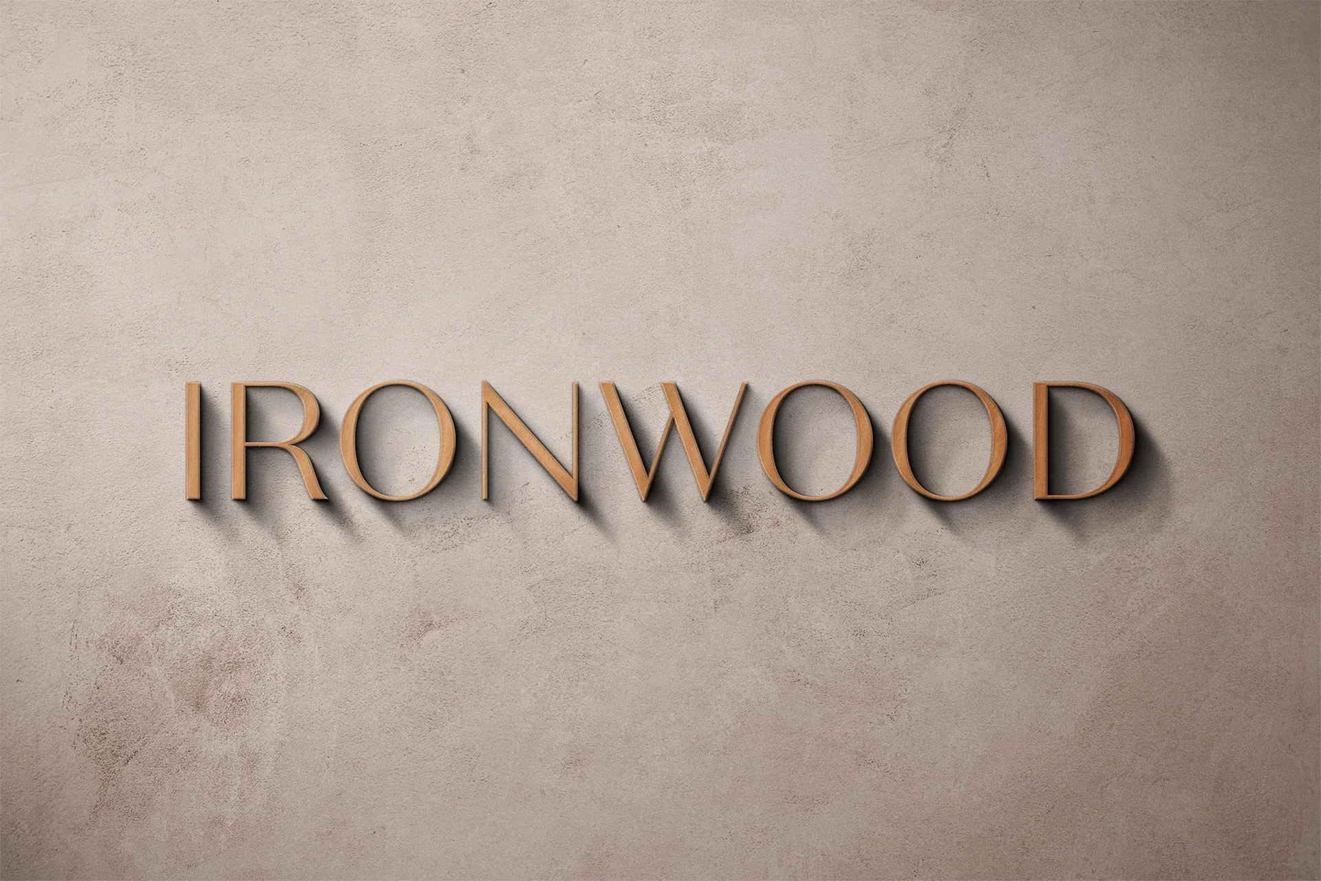
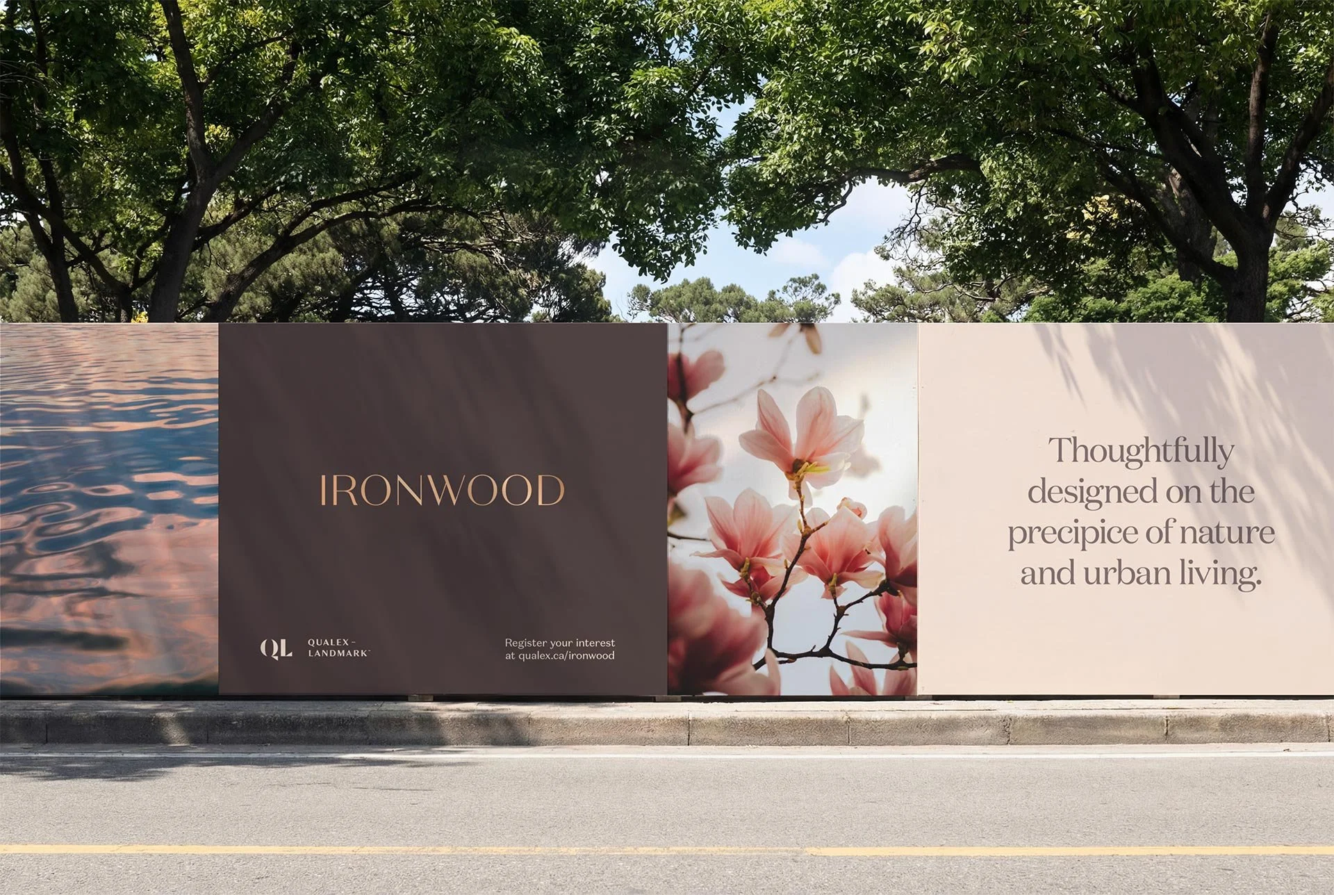

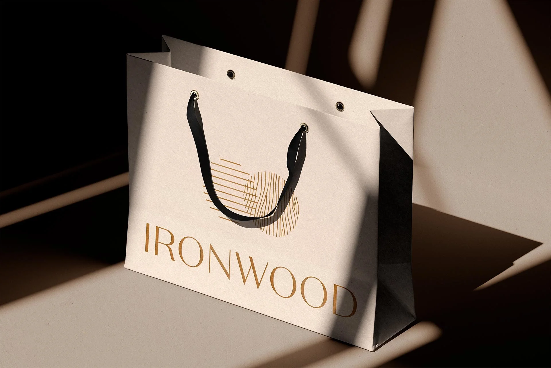
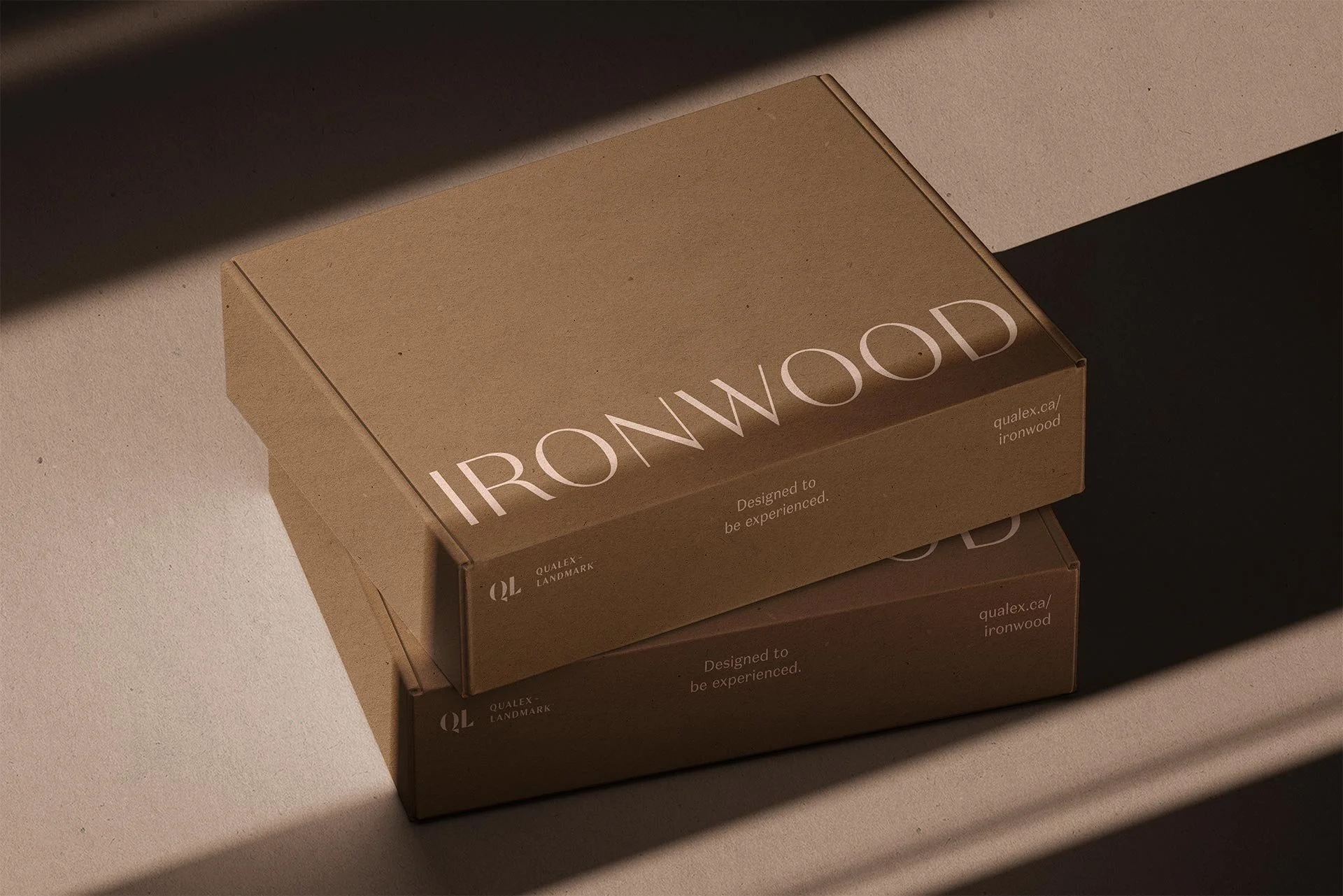
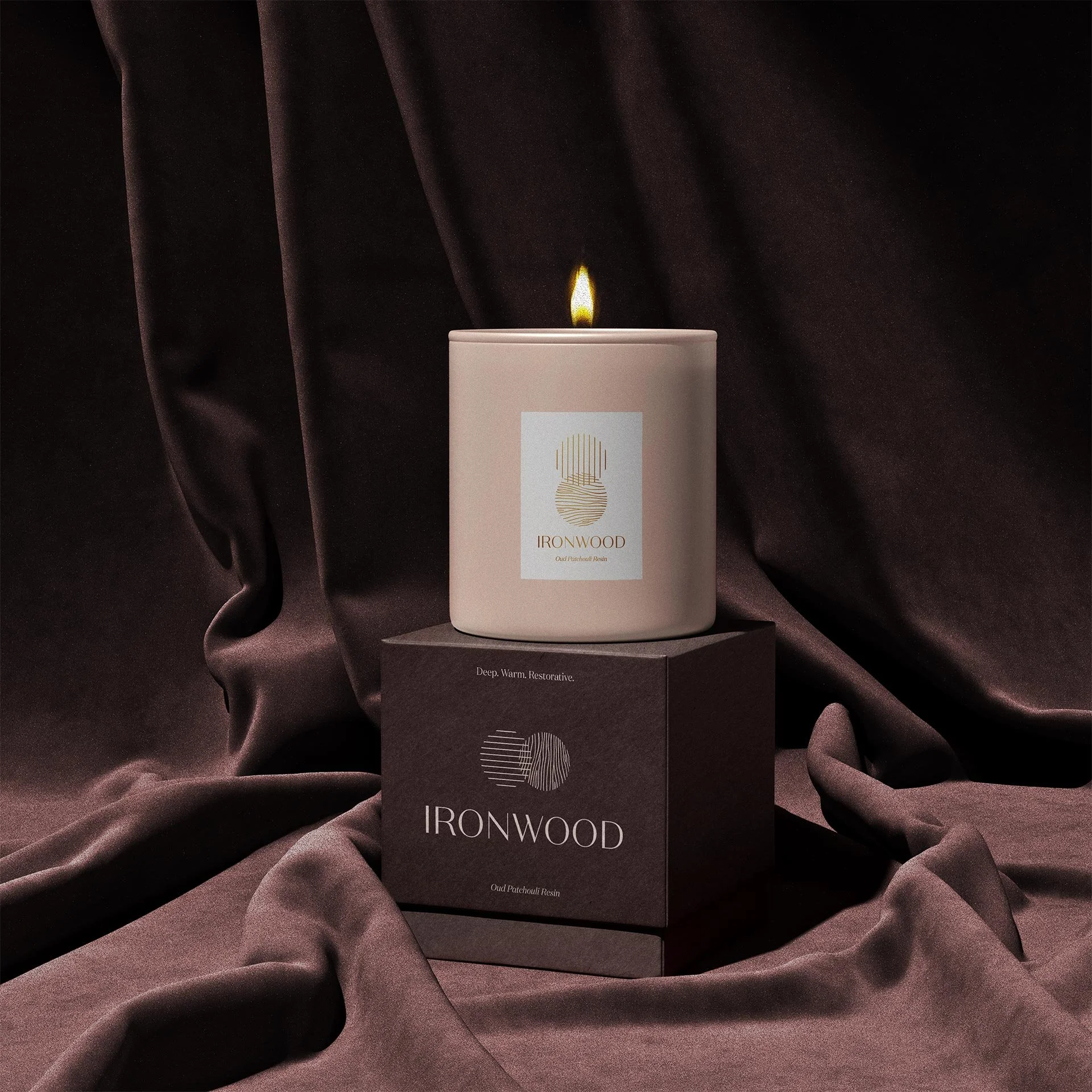

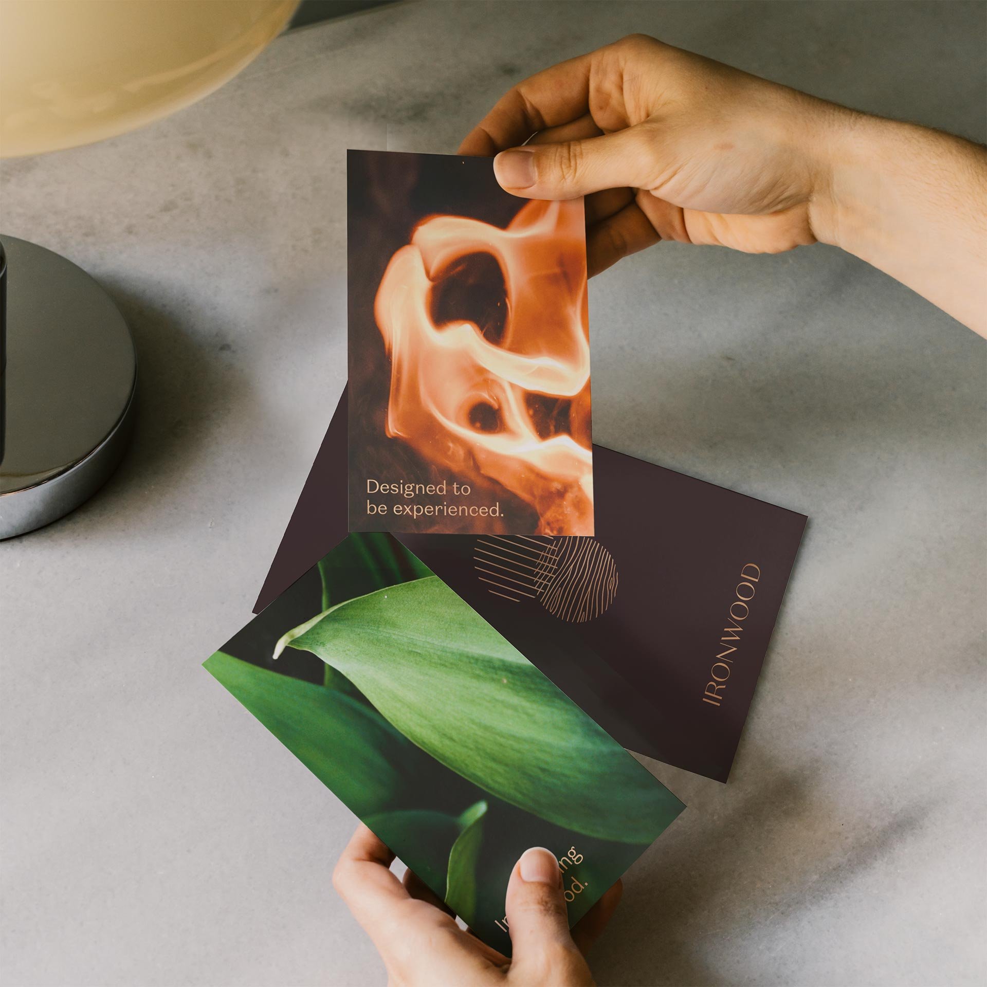
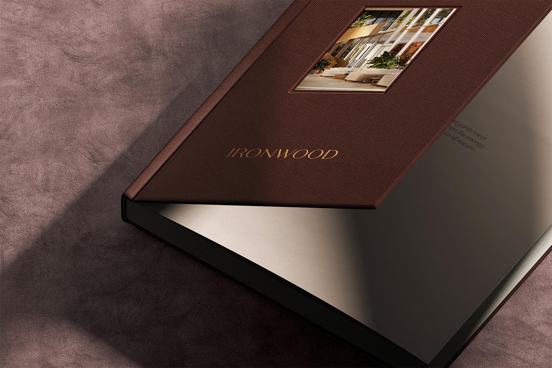


Coquitlam’s skyline was filling fast. Qualex-Landmark wanted to build something different: a home, not an investment vehicle. Ironwood was the answer, a brand built on restoration, restraint, and the quiet confidence of knowing you’ve arrived.
The strategic threat was identified early: clichés at the expense of truth. Real estate marketing is littered with them. Ironwood had to be something else entirely.
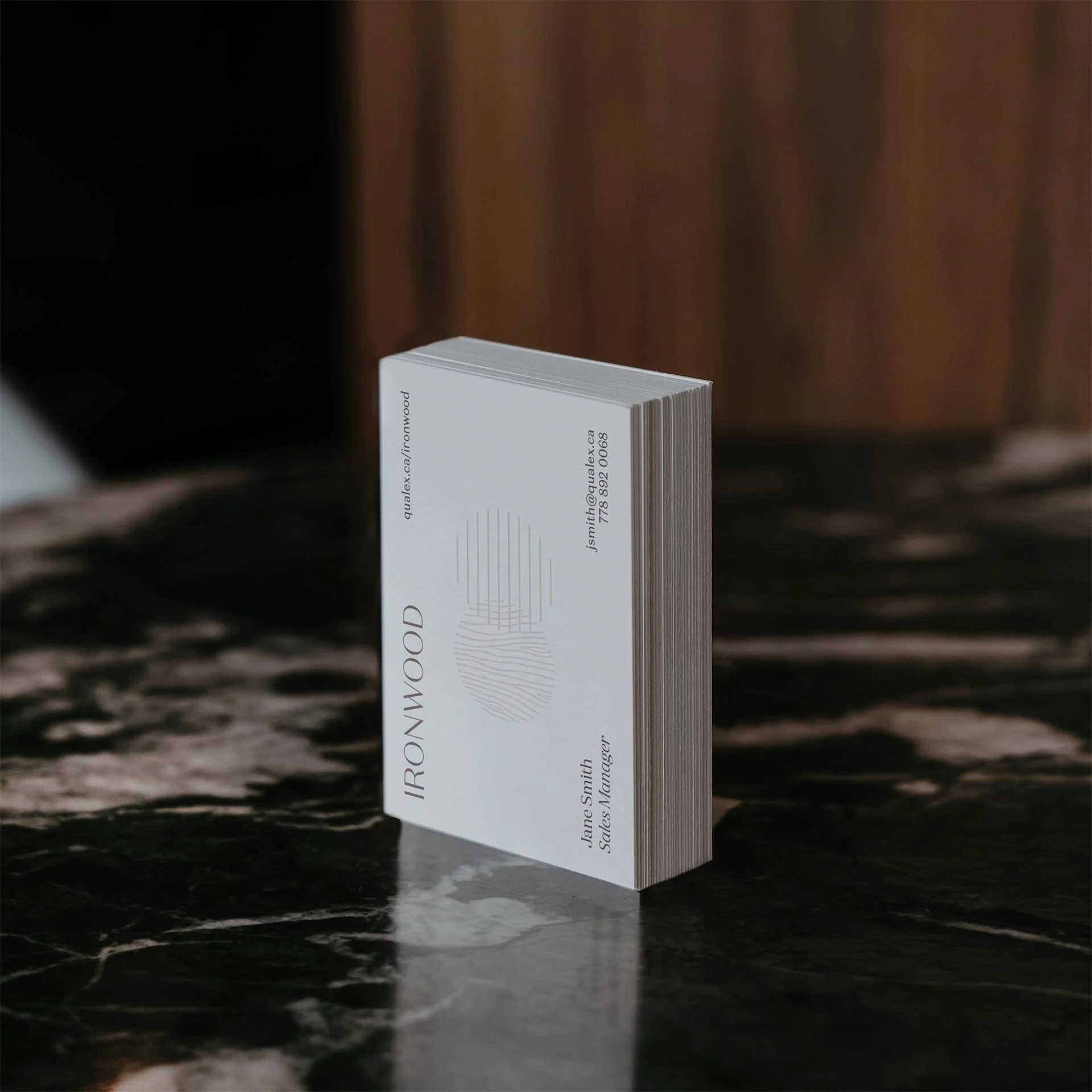
We developed a brand defined by three qualities: restorative, captivating, and understated. The visual and verbal language grew from a single generative idea: real people want breathing room and a living room. Not a showpiece. Not a portfolio asset. A home. Across identity, content, and digital, that idea translated into a brand that positioned Ironwood as an experience rather than an investment. The creative leaned into clarity and restraint, letting the product speak without the usual volume. The result was a brand that stood apart not by being louder, but by being more honest. The promise at its centre was simple and deeply human: You’ve arrived.
Role: Associate Creative Director & Designer
Agency: Full Punch
Web designer: Murray Falconer
Motion graphics: Chad Jones
Client: Qualex Landmark