




Canfor has expanded beyond its Canadian roots, becoming a global leader in forestry innovation and sustainability. The company needed a new strategy and brand identity to move past yesterday’s definition of forestry and embrace tomorrow’s opportunities.
Not long ago, Canadian forestry was regarded as a crown jewel among the country’s resources. Today, however, the perception of Canadian forestry has shifted. Issues such as NIMBYism, protests against old-growth logging, and a political climate that is increasingly anti-forestry have tarnished its reputation. Outside Canada, though, forestry remains a beloved and thriving industry. As a renewable resource, forest products are in greater demand, and global attention is shifting away from harmful materials like concrete and plastic.
Canfor is not your average forestry company; innovation, sustainability, and integrity are at the core of its identity. Originally established with a humble brand identity in the 1960s, Canfor now requires a new brand strategy along with an updated look and feel to reflect its modern success while shedding the baggage of the past.
After conducting an extensive study of the industry, and a series of internal interviews across British Columbia, the United States, and Europe, the Brand Stance came forth to embody the values and principles of Canfor: Better by Nature.
Better by Nature is more than just a tagline; it reflects Canfor’s core values. It highlights the company’s commitment to forest renewal, its focus on future-oriented innovation, its dedication to high-quality products, its emphasis on long-term partnerships, and its profound respect for the forests it manages.
Canfor needed an identity that could carry the company into its next chapter. While many aspects of the brand could change, the strongest elements must endure. There was lasting equity in the existing logo—something familiar, respected, and recognizable. The new logo builds on what came before by retaining the structure of the original mark, but modernizes it through refined typography, a refreshed colour palette, and a more contemporary form.
One of the most symbolic changes was the removal of the tree icon. By stepping away from traditional forestry imagery, Canfor reinforces its transition from a forestry company to a forest products company.
The new brand identity goes well beyond the logo. A modern sans-serif typeface, considered colour system, elevated photographic style, and clear, confident tone of voice all reflect a business that’s grounded yet future-facing. Everything is rooted in Canfor’s new brand stance: Better by Nature.
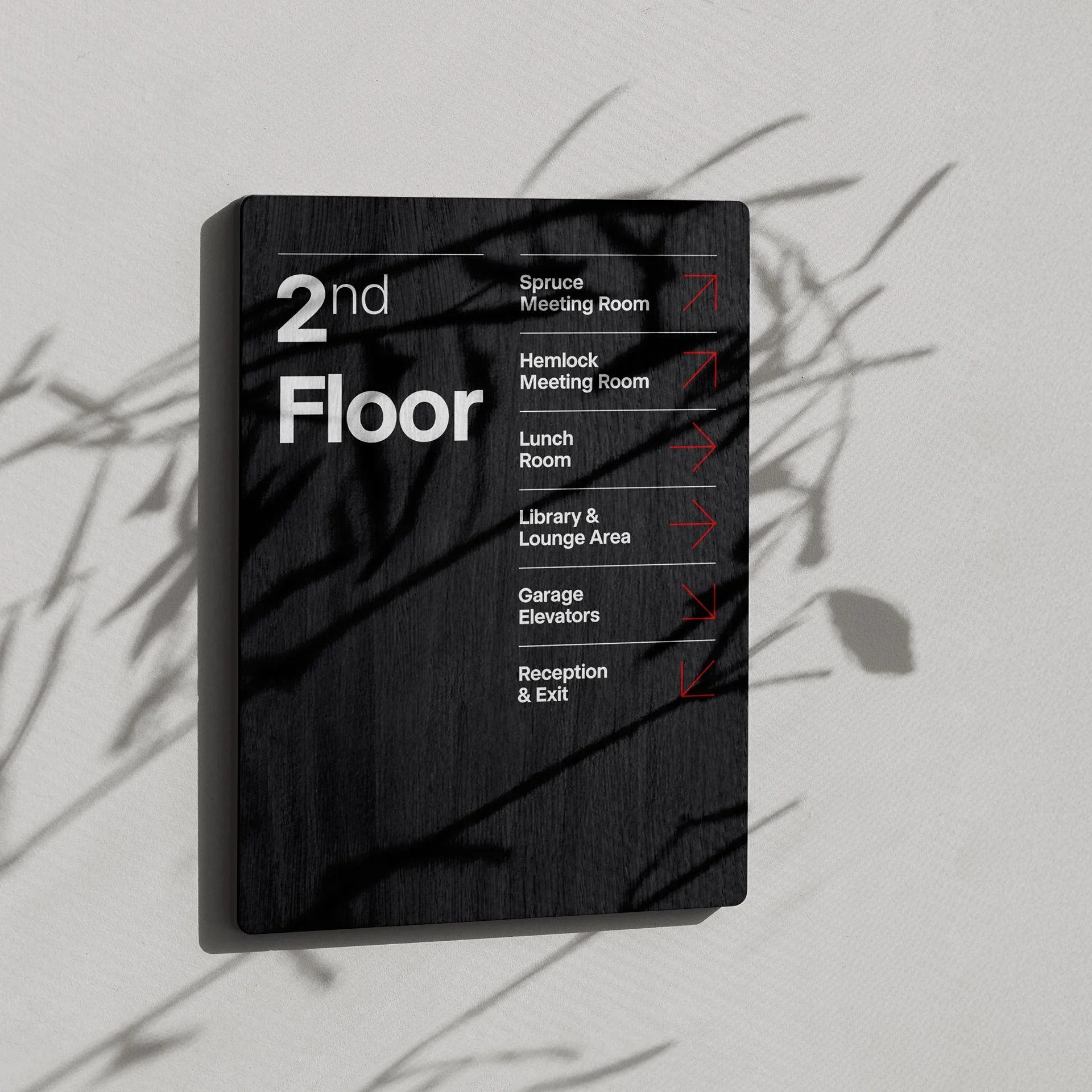
Today, the new identity is present across every touchpoint, from annual reports and lumber wraps to office signage and Canfor’s quarterly magazine. Its most visible transformation is the company’s redesigned website, where the Better by Nature story comes to life through elegant design, powerful visuals, and purposeful messaging. It’s a bold step forward for one of Canada’s most iconic brands—one that reflects where Canfor has been, and where it’s headed next.
Role: Associate Creative Director & Designer
Agency: Full Punch
Website Design: Hey Partner
Client: Canfor