









The CRNS brand needed to create a feeling of partnership between the College, the nurses, and the public. Our goals were to develop a personal and emotional connection, to humanize the brand and to encourage positive conversation — all while maintaining a level of professionalism and sophistication.
In the past, the CRNS has been viewed as a cold and corporate governing body, an organization you might encounter for a slap on the wrist, or administrativia and protocol. At an organizational level, the CRNS needed to change the perception of their brand and create a feeling of partnership between the College, the nurses, and the public. Our goals were to develop a personal and emotional connection, to humanize the brand, and to encourage positive conversation — all while maintaining a level of professionalism and sophistication.
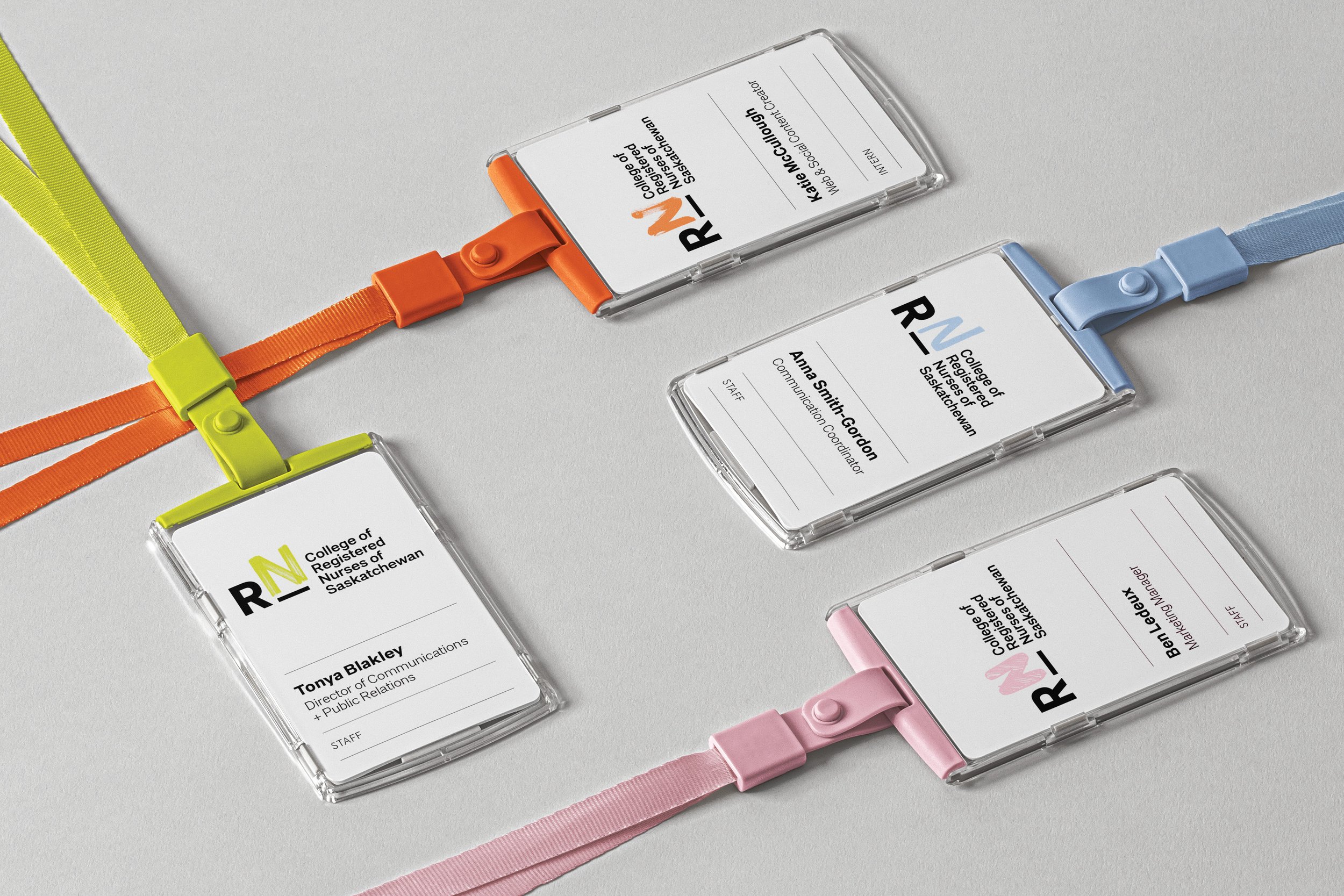
Our brand system revolved around this dynamic logo of hand-drawn N’s. Each was crafted with different brush strokes and colours to represent the diversity and human element of the organization, the nurses and the people.
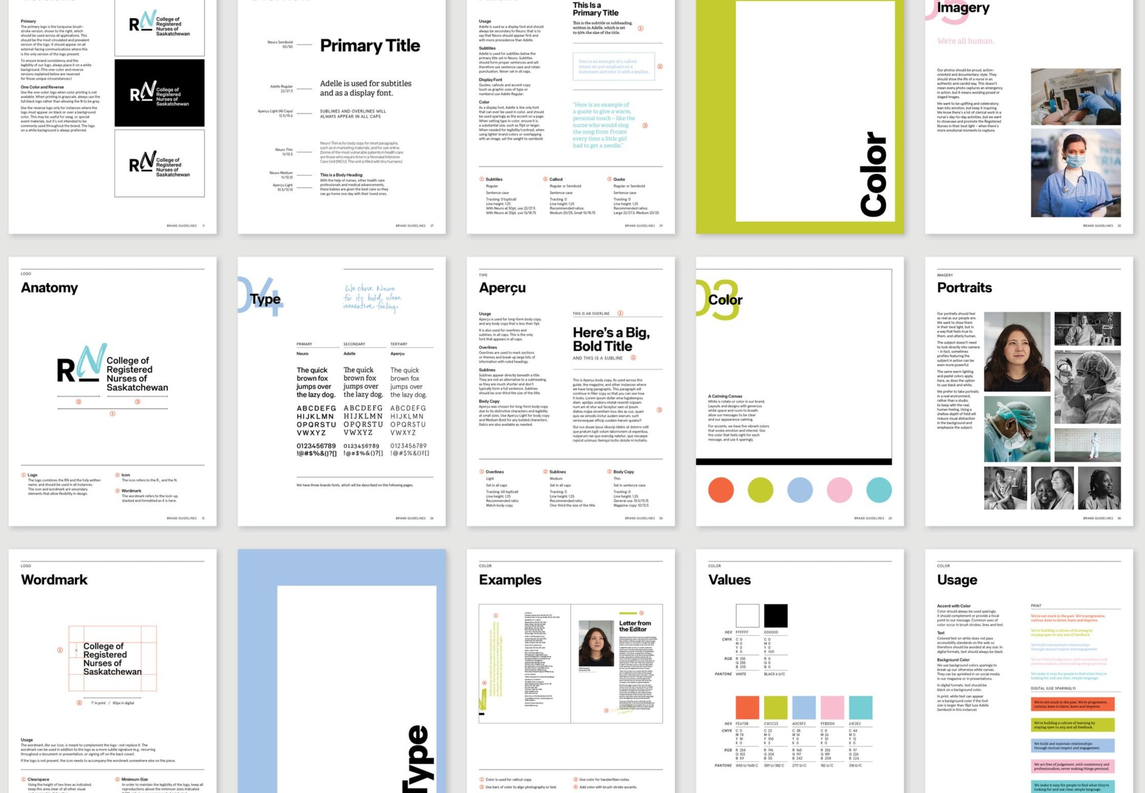
To emphasize the human element and gratitude that every nurse deserved, we developed a brand book that would each be bound in a hand-made Thank You sign.
Role: Senior Designer / Art Director
Agency: TAXI
Client: College of Registered Nurses of Saskatchewan (CRNS)